TL;DR
A design system isn't an enterprise luxury — it's a startup multiplier. Building one at Series A (or even pre-seed) eliminates 30–40% of design-to-development rework, cuts UI decision-making time by half, and makes your product look like it was built by a 20-person design team even when it wasn't. The trigger isn't team size — it's the moment you have more than one person touching the UI.
The Real Cost of Not Having a System
Here's a scenario that plays out in every growing startup that doesn't have a design system. You ship your first five features and they all look slightly different. Buttons are three different shades of blue. The spacing between elements is inconsistent. The loading spinner in the dashboard is different from the one in the modal. Typography headers range from 24px to 28px to 32px depending on who designed that screen.
None of these seem like big problems individually. Collectively, they signal one thing to users: this product is unpolished. And unpolished translates to untrustworthy, which translates to churn.
The internal cost is equally damaging:
- Every new screen requires reinventing decisions — what font size? what padding? what border radius? — that were made (and unmade) in previous screens
- Designers and developers argue about pixels because there's no source of truth
- Onboarding new designers takes longer — there's no system to reference, so they have to reverse-engineer conventions from existing screens
- Refactoring costs compound — when you eventually rebrand or update your UI, you have to touch every component individually because nothing is connected
We've audited dozens of startup products and the average "design debt" — the accumulated cost of inconsistency — amounts to 60–80 hours of rework per product per quarter. At agency rates, that's $9,000–$16,000/quarter in waste that didn't need to happen.
What a Design System Actually Includes
People conflate "design system" with "component library." A component library is one part of a design system. The complete picture has three layers:
Layer 1: Design Tokens
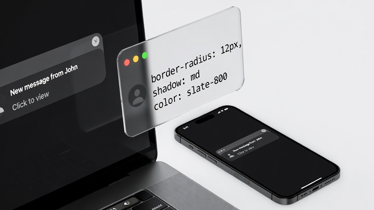
Tokens are the foundational variables — colours, typography scales, spacing values, border radii, shadow definitions, animation durations. They're named, purposeful values that live in one place and propagate everywhere. Change the primary colour token from #3b82f6 to #6366f1, and every button, link, and highlight across your entire product updates simultaneously.
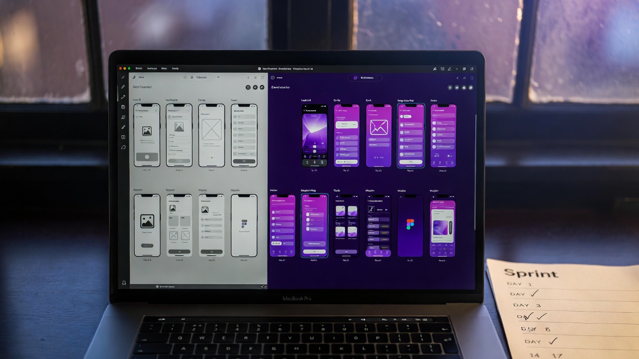
Layer 2: Component Library
Components are reusable UI elements built on top of tokens — buttons, inputs, cards, modals, badges, dropdowns, tables. Each component has documented variants (primary, secondary, destructive), states (default, hover, active, disabled, error), and size options (sm, md, lg). They're built in Figma and mirrored in code (React components, Tailwind classes, or your framework of choice).
Layer 3: Patterns and Guidelines
Patterns are the rules for combining components — how do you build a form? What's the standard for empty states? How do modals work? This is where new team members learn how to make decisions that match existing product decisions, without having to ask a senior designer every time.
Start With Tokens, Not Components
The most common mistake when building a design system is starting with components. Developers want to build buttons. Designers want to design cards. But if you build components before you establish tokens, you end up with components that are hard-coded to specific values — and when those values change, you're back to updating everything manually.
The right starting sequence:
- Colour tokens: Define your palette in semantic terms —
colour-primary,colour-primary-hover,colour-background,colour-text-primary,colour-text-muted. These map to actual hex values, but the rest of the system references the token names, not the hex codes. - Typography tokens: A type scale with 6–8 steps. Define both the font-size and line-height for each step. Name them by purpose, not size:
type-display,type-heading,type-subheading,type-body,type-label,type-caption. - Spacing tokens: An 8-point grid.
space-1 = 4px,space-2 = 8px,space-3 = 12px,space-4 = 16px, etc. All padding, margin, and gap values in your product come from this scale — nothing else. - Semantic tokens: Tokens that reference other tokens —
button-background: colour-primary,input-border: colour-border-default. This is where the real power sits: you can change an entire category of UI by updating one semantic token.
We build design systems for startups.
From token architecture to a complete component library in Figma and code — built to scale with your product, not against it.
Building a Component Library That Engineers Actually Use
The best design system in the world is worthless if engineers don't use it. The most common reason design systems get abandoned is the gap between Figma and code — the system looks one way in the design tool and another way in the product.
The solution is to build the code components in parallel with the Figma components, from day one. Your stack determines the approach:
- React + Tailwind: Build on Shadcn/UI. It's an open-source component system that maps directly to Tailwind tokens. You customise it to your brand rather than building from scratch. Ships in 2–3 days.
- React without Tailwind: Radix UI + CSS modules or Emotion. Radix handles accessibility and behaviour; you style it. Clean separation of concerns.
- Vue or other frameworks: Headless UI by Tailwind Labs or Radix Vue. Same principle.
The rule: every Figma component maps to exactly one code component. If a component exists in Figma and not in code, it doesn't exist. If a component exists in code and not in Figma, it doesn't exist. The Figma file and the codebase are the same document in two languages.
Naming Conventions That Scale
Component names matter more than people think. Use a consistent naming convention from day one: ComponentName/Variant/State. Example: Button/Primary/Default, Button/Primary/Hover, Button/Destructive/Disabled. This structure is navigable, predictable, and works equally well in Figma, Storybook, and your codebase.

When to Build a Design System
The question we get most often is: "Are we too early?" The answer is almost always no. Here's the decision tree:
- You have one designer and one product: You don't need a formal system, but you should establish token-level variables in Figma and agree on a spacing scale. Cost: 4 hours. Saves: 40 hours over the next 6 months.
- You have more than one person touching the UI: Build a lightweight system immediately. Even a tokens + 10-component library pays for itself in the first sprint. Cost: 3–5 days. Saves: 20+ hours per sprint.
- You're about to raise a round and plan to grow the team: Build a complete system before you hire. It's dramatically faster to build without a larger team, and a complete system lets new hires contribute immediately without introducing inconsistency. Cost: 2–3 weeks. Value: priceless for onboarding velocity.
- You have 5+ designers and engineers: You're almost certainly already feeling the pain. Build the system now — every week you wait adds to the debt.
The ROI of Consistency: What the Numbers Show
Design systems have a measurable return. Across the products we've worked on, here's what a well-implemented design system produces:
- Design velocity: New screens take 40–60% less time to design because decisions are made at the system level, not the screen level
- Development velocity: Component assembly is faster than custom CSS. Engineers can build new screens by composing existing components rather than writing new styles from scratch
- QA time reduction: Bugs related to visual inconsistency drop by 70–80% because components are tested once, at the component level, not on every screen they appear
- Rebrand cost reduction: When the brand evolves (and it will), updating a design-system-equipped product takes days, not months. Update the tokens, regenerate, done.
Concrete example: one of our clients, a SaaS dashboard product with 12 screens, was spending approximately 14 hours per sprint on design-to-dev handoff, revision cycles, and visual bug fixes. After implementing a design system, that dropped to 4 hours per sprint. At a blended rate of $100/hour for design and engineering time, that's $1,000 saved per sprint, or $26,000/year. The design system cost $8,000 to build. Payback period: 3.5 months.
FAQs
Should we build our own or use an existing system like Material Design or Ant Design?
Use an existing system as a foundation, not as a final product. Shadcn/UI and Radix UI give you accessible, production-ready components that you skin to your brand. Building entirely from scratch is almost never justified at startup stage — the ROI isn't there. Adopting a complete third-party system wholesale (like unmodified Material Design) makes your product look like every other Material product, which is a brand problem. The middle path — customised foundation — is the right answer in almost every case.
How do we keep the Figma file and codebase in sync?
Discipline and process, primarily. Designate one person as the design system owner. Any change to a component — in Figma or code — goes through them. We also recommend Storybook for the code side: it creates a visual catalogue of all components in their various states, which serves as a living document that both designers and engineers can reference. Tools like Supernova can automate token syncing from Figma to code, which eliminates the most common source of drift.
What's the minimum viable design system for a pre-seed startup?
At minimum: a colour token file in Figma with semantic names, a typography scale, a spacing scale, and 5–8 core components (Button, Input, Card, Badge, Modal, Dropdown, Table row). That's a one-day effort that prevents years of inconsistency. Don't wait until you have the "right" amount of time or team — start small and grow the system as the product grows.
Can LoopSuit build a design system for our existing product?
Yes. We do design system audits and builds for existing products regularly. The process starts with auditing your existing UI to extract the implicit decisions that have been made (what colours are actually used, what spacing patterns recur, what components exist in practice), then formalising those into a proper system. This is often faster than starting from scratch because there's an existing body of design decisions to work from — we're making them explicit, not inventing them.