The Challenge
TD Bank’s mobile app serves as a daily financial lifeline for millions across North America. However, as features accumulated over years, the legacy experience suffered from what I call "feature calcification"—layers of functionality added without a cohesive architectural strategy.
Users faced cluttered transaction lists, inconsistent navigation patterns, and deeply buried features. This wasn't just a UX inconvenience; it was a business problem, resulting in high cognitive load and an excessive volume of support tickets (12,000+/month).
"Our mission was to modernize the interface while strictly preserving the familiarity and trust that long-term enterprise customers relied on."
We aimed to transition from a "bank-centric" view (lists of accounts) to a "customer-centric" view (insights, actions, and clarity), all while adhering to strict WCAG 2.1 compliance and ensuring zero downtime.
The Process: From Chaos to System
We didn't just redesign screens; we built a scalable operational framework.
01. Audit
Heuristic evaluation of 50+ screens & stakeholder interviews.
02. Explore
Low-fidelity wireframing & IA restructuring.
03. Systemize
Building atomic components (cards, chips) for scale.
04. Prototype
Hi-fi interaction design & user testing.
05. Handoff
Detailed specs, QA support & rollout.
Streamlining Account Activity
Account Activity is the "heartbeat" screen of the app. The legacy design was a dense list of text that made it impossible to scan for specific transactions, creating friction at the most frequent touchpoint.
-
1Cognitive Overload Dense text blocks with no visual hierarchy made finding "that one coffee purchase" a chore.
-
2Hidden Context Key details like merchant location or category were buried in nested sub-menus.
-
3Accessibility Failures Poor contrast ratios and small touch targets excluded many elderly or impaired users.
-
1Card-Based Layout Grouped transactions logically with clear logos and category icons for instant scanning.
-
2Progressive Disclosure Used bottom sheets to show details on tap, keeping the main feed clean but informative.
-
3Atomic Components Created a master "Transaction Row" and "Detail Sheet" component reusable across all account types.
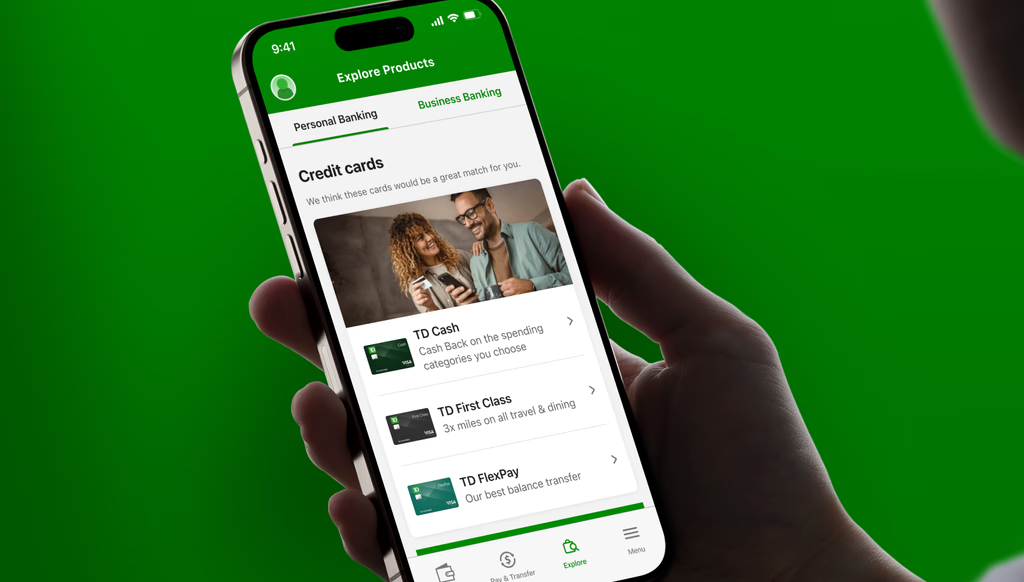
Dashboards that Drive Discovery
Beyond basic banking, TD needed to surface relevant financial products (Credit Cards, Loans) without feeling aggressive. We moved from static, "banner-blind" ads to intelligent, context-aware discovery cards.
Modular Widgets
Designed a library of flexible widgets (Offers, Credit Score, Spending Analysis) that can be dynamically reordered based on user behavior segments.
Contextual Relevance
Instead of generic ads, we implemented logic to show "Travel Cards" to users booking flights, boosting click-through rates significantly.
One-Tap Action
Removed friction by allowing users to "Apply" or "Learn More" directly within the dashboard context, significantly reducing drop-off.
Bottom Line Impact
The redesign didn't just look better; it performed better. We validated success through rigorous A/B testing and post-launch analytics.